WIZELY
THE PROBLEM
Conventional financial advice tells young people to save and invest and then use their money to live a happy retired life at 65. However, more and more young people want to be able to enjoy their money while they're young and live their aspirational lifestyle.
THE OPPORTUNITY
How might we help young adults responsibly afford their aspirational lifestyles?
MY ROLE
Product Design Intern
PROJECT TYPE
Redesign
DISCIPLINES
UI Design, Prototyping, User Interviews, Usability Testing
PLATFORMS
iOS & Android Mobile App
IMPACT
CONTEXT
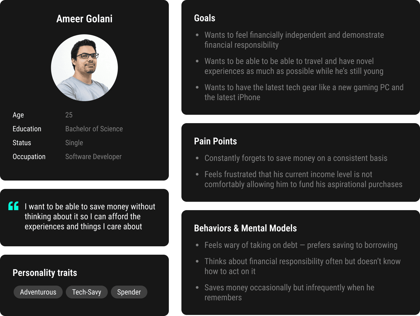
I joined the Wizely team after they had collected 4 months of user feedback from their V1 product. The challenge from here was to redesign the app from the ground app to address the user needs that were discovered. To contextualize these user needs I created a persona for whom we'd design the new experience.
ISSUE #1 — CONFUSING USER FLOW
Users earned Wizely score by saving daily or completing in-app quizzes, challenges, and polls. At month's end, score converted to discounts with brand partners. The path from activity → score → reward was unclear.

ISSUE #2 — CLUNKY + CLUTTERED UI
The user interface design of V1 was outdated and extremely clunky. The homepage was also flooded with CTAs that made it unclear where a user should start.

ISSUE #3 — INFLEXIBLE SAVING
Users wouldn't be able to earn Wizely score unless they saved every day. The reality was that users would rather save a large amount every once in a while. The notifications also got really annoying.
V2 DESIGN DIRECTION
We modeled the V2 experience around the core user flow: help users save → help users spend.
To support this experience we brainstormed numerous features and used an impact effort matrix to help us define priority for a V2 MVP.
The final core features included: a simple save flow, autosave capability, a wishlist to motivate users to keep saving, and a shopping portal for users to redeem their savings through our brand partners.
DESIGN PROCESS – USABILITY TESTING
We put our mockups through two rounds of usability testing and measured task success rate, task completion time, and System Usability Scale score. The final flows and associated metrics are shown below.
SAVING FUNDS
18s
Avg task completion time
(vs. 15s for expert)
100%
Avg task success rate
MANAGE AUTOSAVE
47s
Avg task completion time
(vs. 25s for expert)
87.5%
Avg task success rate
ADD A WISH
24.5s
Avg task completion time
(vs. 15s for expert)
100%
Avg task success rate
SPEND SAVINGS
24.5s
Avg task completion time
(vs. 15s for expert)
100%
Avg task success rate